HTML / CSS
My expertise in HTML and CSS allows me to render complex designs in the browser window using elegant, easily maintained code. Relying upon advanced CSS techniques, I produce pages that conform to the highest standards of code validity and content accessibility.
Standards and Accessibility
I code pages to the XHTML 1.0 standard, meaning HTML which is also valid XML. Such pages are operable on a wider variety of platforms, and will continue to be as technologies evolve for the forseeable future. I have also used XHTML snippets in conjunction with Flash, to code HTML forms which can also be rendered in a Flash module by means of Actionscript’s XML parsing capabilities.
I place a high value upon cross-browser consistency in the rendering of web pages I produce, and thoroughly test sites on Internet Explorer 6 & 7, Firefox 1.5+ (Windows & Mac), and Safari 2+.
I take care to write code which facilitates access for the visually impaired who use screen reader technologies, in accordance with the most current standards for government and academic institutions. This includes:
• Proper source order
In a conventional page layout with columns, the “main” page content (generally the central column) should appear first in the HTML code. Since a screen reader reproduces the page content in the order it appears, this avoids forcing the user to listen to all the links in a lengthy menubar every time he or she loads a new page.
• Accessible image links
I code buttons and other image links (with rollover effects) as text links with image backgrounds. The text is hidden from regular browsers, but remains accessible to the screen reader.
• Table-less layouts
Some screen readers will read out every table element as they proceed through an HTML table. Advanced CSS layout techniques allow multi-column pages and flexible positioning to be achieved without the use of any tables in the HTML code.
For an example of all three of these features in action, see the Pluralism Project web site.
Advanced CSS Techniques
To achieve the standards detailed above, I use advanced CSS techniques for page layouts and navigational elements.
Fluid Page Layouts
When designing sites I favor fluid page layouts, which fill the entire available width of the browser viewport. In contrast to fixed-width layouts that occupy a fixed dimension in the center of the viewport, with wasted “margin” space to the right and left, fluid layouts allow users greater flexibility in choosing the font size and length of text lines that they prefer.
Fluid layouts demand much greater attention to the positioning of elements on the page, which must accommodate a wide range of viewport sizes. For conventional page layouts with columns, I use a variation of the “Holy Grail” layout first published by A List Apart, which I have modified to make more robust and more compatible with Internet Explorer 6.
Decorative images also present a challenge for fluid layouts, since the space they occupy will vary and may result in large blank areas on the right and left sides of the image. I have developed a technique for “curtained” images which takes a very wide image and masks the right and left sides of it when the page is displayed in a narrow space, but reveals more of the image in a wider space. For an example, see the Flash slideshow on the Pluralism Project homepage.
Navigational Elements

Accessible image links, described above, rely upon a CSS background image to create a text link with the appearance of a button. The “on” and “off” states of the button are both present in a single background image, whose position is manipulated by CSS.
This technique presents distinct advantages over the more commonly seen Javascript image swaps, as it reduces the amount of code required and the number of images to be downloaded. The rollover effect is furthermore automatically available when page load is complete, avoiding the need for further Javascript to preload the “on” state images.

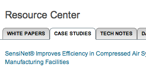
Another form of accessible navigational elements I have developed are tabbed links, used on the Sensicast Systems website. These are plain text links with sophisticated styling that can accommodate a variety of tab widths. One advantage to producing tabs in this way is that they can be easily modified just by editing the HTML source code.